|
|
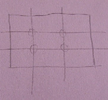
Composition GuidelinesThe composition of your finished painting needs some careful consideration. Some simple guidelines that help are...
No one point of interest?
No one point of interest -- that is fine though you need to consider how the viewers eye will be led around the painting. This can be done with:
In Wikipedia we learn... Some principles of organization affecting the make-up of a picture are: Shape and proportion Balance among the elements Harmony, or consistency among the elements The orientation of elements The area within the field of view used for the picture ("cropping") The path or direction followed by the viewer's eye when they observe the image Negative space Color Contrast: the value, or degree of lightness and darkness, used within the picture Geometry: for example, use of the golden mean Rhythm Illumination or lighting Repetition (Sometimes building into pattern; rhythm also comes into play, as does geometry) Perspective Breaking the rules can create tension or unease
As you become more experienced and confident in experimenting you will find that 'breaking the rules' creating tension or unease is just whats required to give your painting a wow factor.
|

